When you’re running your own business, the need for basic designs shows up from time to time. It may be a PowerPoint, a flyer, an email blast or any other piece of collateral that you probably need in a hurry, for free.
Cases like these often result in the most artsy employee putting something together – and that doesn’t always get you an effective design. Many people are not aware of some very useful design principles; it’s a skill that takes practice just like anything else.
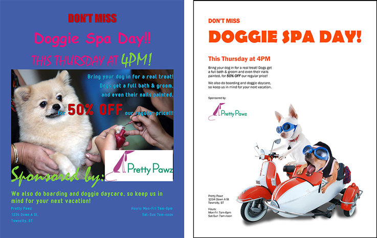
Here are some key design principles that will help you or your designated power point maker in a tight spot. I’ve created example flyers in Microsoft Word for a pretend dog groomer, Pretty Paws, to help demonstrate the change that these design tips will make. The purple one is what you shouldn’t do, and on the right is my suggested edits.
Stick to one font
This makes it a thousand times easier to read. If you know what you’re doing, using two fonts is okay. But generally, one font (actually it’s called a typeface) is all you need. Keep it simple.
Also, if this flyer is going to be printed and read in someone’s hand, the text should never be more than a 12pt font, unless it’s the title. A 12pt font is plenty big enough to read. Actually, 8pt is big enough to read. I know it looks small on the screen, but just remember, what you’re seeing here isn’t even a fourth of the full size.
Use one alignment
People have a tendency to center text in the middle of the page, because symmetry seems the easiest to design. Center alignment is fine, but only if everything is centered. Often you’ll see a centered title, and someone has tried to stuff every corner with a bit of text, the date here, the logo there, and now the eye doesn’t know which to look at first. You’ve got to build a road for the viewer’s eye so they know where to start, and keep that path aligned so they can make it to the end. I chose a left alignment for Pretty Paws.
Pick one thing to be big
This is also part of helping the viewer know where to look first. When you walk into a room, you’ll notice immediately if there’s a 7-foot sumo wrestler in the crowd, and you’ll probably wonder why he’s there. If you walk into a room that’s full of 7-foot sumo wrestlers, you get scared and leave.
Don’t scare the viewer away with a giant title, a giant subtitle, giant text, and a giant logo. Big also means bright, so don’t make everything a bright color, either. Pick the most important thing to be big, make it large and bright, then let everything else be smaller. I promise you, if people want to go to a doggie spa, they’ll look for the rest of the info. There’s no need to yell it.
If it’s in a box, it’s out
When designers make a logo for your website, they often save the logo as something called a JPEG. This means it’s low resolution and has a white box in the background. Don’t use this for anything you want to print, and definitely don’t use this on a color background. Ask your designer if they can give you the logo as an EPS or a PNG with a transparent background. If not, place it strategically on a white canvas like how I did for Pretty Paws.
Make sure it’s legible!
If you have to outline your text in black or white so that it’s readable, there’s something wrong with your design. It’s probably the background or the colors you’re using, or the size of the text. I decided to change my picture, not only because the fluffy dog looks horrified, but because there’s a lot of white space next to the scooter dogs, and that gives me more room for text. The white background also makes the words easier to read.
Hopefully this helps with your next in-house project. If not, we can still help. Contact Convergent1 today, we’re happy to do the designing for you.