Not too long ago, designers all over the world celebrated the release of the iPhone’s new flat design user interface. To many, this signaled official permission to stop using Apple’s ubiquitous skeuomorphic designs that had been all the rage since the days when iMacs were little CRT’s wrapped in colorful semi-transparent bubbles that looked like they had been extracted directly from a Jetsons cartoon.
To many, this demonstrates that personal computing has finally reached a maturity point where it no longer requires a connection to our physical world, that we all know what a smart phone is, what it does and is not to be feared. That its user interface can stand on its own and simply be the medium through which you communicate with your device’s functions, not a digital representation of real-world objects such as buttons, textures and light gradients and shadows.
That may all be true, but at the end of the day, the purpose of UI is to allow a human to be able to interact with and direct all of a device’s functions. To that end, the interface on a website or smart phone app should be clear, intuitive and responsive, no matter what fancy term you give to its “design language.” A human needs to see a series of titles, notices and buttons and have a pretty good idea of what they are, what they do and where to find them within the layout. Color helps different different areas stand out. Font sizes, colors and styles help differentiate titles from instructions from notices from buttons, etc.
Which leads me to this – at what point does a designer get carried away with flat design? At what point does all of the content on an app or on a web page get confusing? Does the user know where to press or click to initiate an action? Does the headline look exactly like the main body copy?
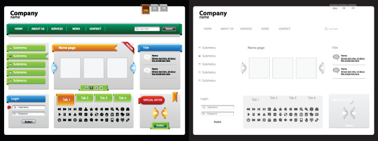
Working with WordPress themes, we see a lot of new designs that simply look like unfinished wireframes. They may fit under the category of fresh flat design, but frankly, many seem like the designer was just being lazy. Responsive design means a minimalist approach and lean code for a smart phone’s lack of processing power and slow data connection. But does that mean all of the text has to be the same gray? Does that mean you can’t specify a background color for a notification area or a button?
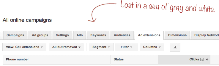
Some of Google’s apps are good examples of what happens when simple, flat design goes too far. Their Gmail interface is a blur of gray, light gray and white. Many who were born before last year have to strain their eyes to make out all of the text and ultra-thin, light gray lines and shapes. And don’t even get me started on the AdWords interface. With such a complicated tool that has so many options, pages and lists, a little bit of color and text differentiation would go a long way toward helping mere humans understand it and use it effectively.
Flat design will be with us for a while, so let’s make the most of it. Let’s do it right. UI designers should remember what the U stands for. A good design can be flat, minimalist, lean, responsive, friendly and effective, all at the same time. Thanks to Hongkiat.com, here are 20 examples of Beautiful Mobile User Interfaces. You’ll notice many of these examples make great use of color and typography to differentiate content from buttons. At a glance you can tell what you’re looking at and have an idea of where you would need to press to interact with the functions.
So while skeuomorphism will soon be as dead as disco, user friendliness and clarify of function will live on, as long as we remember that flat design does not have to mean no design. Designers of the world – rejoice!