
For years, Google has been warning webmasters to take necessary actions to make mobile search a top priority. Now, with Google’s planned algorithm update (April 21st, 2015), it is more important than ever to take the steps to see if your website is mobile responsive and to take action.
While Google’s March announcement provided much more notice than they usually give before major algorithm updates (most come with vague or no warnings), they have still been frustratingly opaque with details. There have been speculations, but little confirmation from insiders and Google employees. Still, most webmasters are planning ahead with the following assumptions:
- The Googlebot must be allowed to crawl Javascript and CSS to pass the “mobile-friendly” test.
- Responsive designs will not have any additional ranking benefits.
- Tablets will not be affected by the new algorithm.
- Google may have a dedicated mobile index, possibly as soon as April 21, 2015.
- Mobile friendliness will be determined per page, not sitewide.
Prepare for Mobilegeddon
In the Google-centric SEO world that has already survived “panda“, “penguin” and “hummingbird” attacks, there are several items that your organization should review before “Mobilegeddon”:
1. Familiarize Yourself With What “Mobile-Friendly” Means
Sure, it sounds simple enough, but if you ask a million people what “mobile-friendly” means, you will likely receive a million different answers. Many of these processes may be already in place for your website but for the sake of argument, we’ll abide by Google’s definition of mobile-friendly:
- Your website uses readable text without zooming.
- Your website’s content fits the screen; users do not need to zoom, or scroll – either vertically or horizontally.
- Your website’s spaces links far enough apart that the correct one can be tapped easily.
- Your website avoids software that is not friendly to mobile devices (e.g. Flash).
2. Test Your Website
If you haven’t tested your site’s mobile-friendliness, make it your priority. To start, you can simply find your website’s listing on the Google search results for mobile. Your site needs an update if the “mobile-friendly” tag does not appear beneath your URL. You can use Google’s free Mobile-Friendly Test to see how your site performs on mobile devices by entering a URL directly from Google. Analyze the results of the quick test. If it fails, then your site needs to updated as soon as possible. Even if your site passes, items like Google’s PageSpeed Insights can provide further statistics on other items that can affect your site’s search rankings.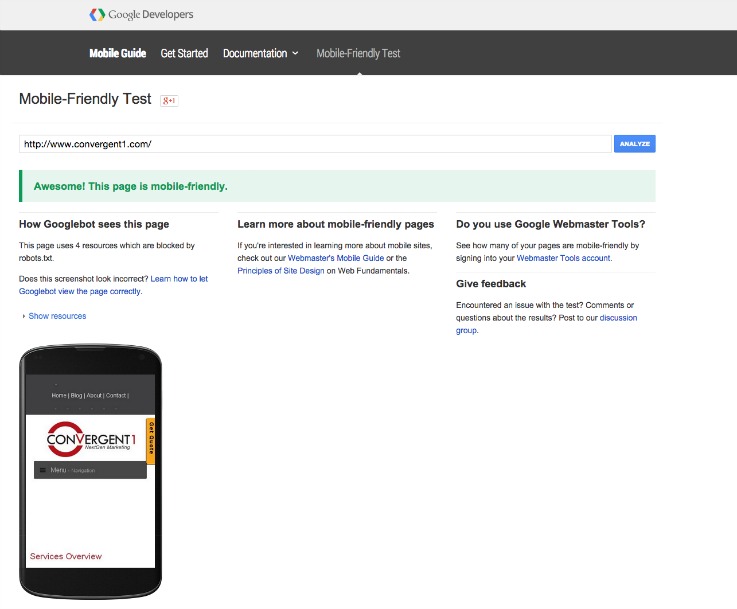
3. Fix the Problems
After running Google’s Mobile-Friendly Test and PageSpeed Insights, identify the issues and options available to fix them, and analyze whether or not your website is currently “mobile-friendly.” Consider reconfiguring your site if the mobile-friendly designation is not reached. Google recommends a responsive web design using the same HTML and URL across mobile devices. This responsive design renders the appropriate display for all devices through your website’s CSS. If a responsive web design is not found, your webmaster can still make sure that your site is mobile by either configuring your site through dynamic serving. This configuration will use the same URL, but will use a different version of HTML to service different types of devices. If you must, you can also use separate URLs to match each code with certain devices by using each separate URLs and employing HTTP redirects. Keep in mind that even if your website is considered “mobile-friendly” it is equally important to make sure that Google sees it through signaling its mobile configuration and that Google’s bots can crawl your pages. While these processes will vary, you can get a head start by making sure that your webmaster allows access to your site for Googlebots to crawl. A quick reference to Google’s Mobile Friendly Guide can help provide detail on how to do this and provide other tips and suggestions for your website.
4. Convert Your Site
For sites built through an open-sourced CMS (e.g., Drupal, WordPress) that are currently not considered “mobile-friendly, convert your existing site to a mobile-friendly version. This can be as simple as performing an update, but other options can include creating a mobile version of your site (while keeping the desktop version the same) or, if you have CSS/HTML knowledge, you can customize your site to make it mobile-friendly though this route will take considerably longer than the alternative methods. Whatever method you choose, make sure to backup your website before any CMS updates or other changes are made.
Changes to Google’s algorithms often come without warning and with little detail in regards to what types of changes will be made. Fortunately for most webmasters, this new update was provided with enough information to get started on critical changes that should be made and tests that should be run in order to ensure that your website is in position to emerge from “Mobilegeddon” unscathed. However, if the entire process seems too complex, have no fear! We have been working tirelessly over the past few months in order to ensure that all of our clients’ websites are fully optimized and set to go for tomorrow’s big change.
There has never been a better time to update your website. If you would like our team of experienced and dedicated web analysts, SEO specialists and content curators to help optimize your website, increase traffic and provide your company with the business solutions that come with a website redesign, contact Convergent1 today!